Easel 20 - Summer 2008
 Editorial
I hope that all of us continue to learn whatever our age. Even the most aged of our membership has space to grow in knowledge and skill because not one of us has yet attained perfection in anything. This issue has much to teach us - from fat and lean oil paint to framing, photography and yet another “stir” that deserves a response.
Art / Craft - what is the difference? asks Sue Howes. This must be something to raise the hackles of those who argue that Craft cannot be Artistic. I look forward to your responses.
Please, let me have your items for the next issue by mid-July 2008 or sooner, if possible, as THE EASEL must be presented to the printer in early August to ensure distribution by the first week in September. Remember, I want your best work for the cover of The Easel. Good, clean black or grey drawings may find their way onto inner pages.
Painting and Photography - Comparing Notes
Andrew Herbert’s talk (on 4th April) was fascinating and heavy in content and there- fore I have endeavoured only to summarise this intriguing evening.
He posed the question “How does a judge judge?” and proceeded to outline the many elements of photography and to explain what a judge looks for. He listed those elements which pretty much coincided with the ‘rules’ of painting albeit under different names. Content, technicals – exposure, focals and aesthetics. He said that portraiture would come under technicals and landscape under aesthetics. However, if a photograph depicted an emotional subject (war, street children etc.) it might be deemed a good photograph even though technique might he lacking.
On the subject of colour he said that the photographic palette eomprised red, blue, green, yellow, magenta and cyan and, of course, black and white whereas more hues were available to painters. However he considered that composition was the greatest similarity between the two media.
Andrew then involved us by inviting us to list painting ‘rules’ and we specified the golden section, triangles and circles, perspective (lead-in lines), foal point, tonal values. recession, framing. light and shade, and symmetry. He then touched on one striking disparity between the two media and that was ‘differential focus’ which occurs in photography but which he hadn’t seen in painting. This involves subjects appearing to he in and out of focus. For example blurring the foreground to concentrate on a more distant object and vice versa. He also highlighted another difference – that of viewpoint which, in photography is usually about five feet above the ground. He then showed some of his own photos and we discussed their strengths and weaknesses.
At this point the dingbats among us were grateful for tea break as our brains were throbbing.
After tea Andrew dealt with the history of photography from Daguerreotypes which started about 1839 when the negatives were on paper, then the process moved on to copper plates, through glass plates and then onto cellulose with which we are all familiar. He explained that early photography was the preserve of scientific types (chemists) and when glass plates came in, artists and chemists collaborated.
He then showed us some slides of famous ‘old masters’ and discussed why, as a photographer. he considered their perspective and composition etc. to he good or bad. At this point my brain had stopped throbbing and had settled back into its normal state of torpitude.
Should this report seem long and boring I would stress it is purely the fault of the writer and no reflection on Andrew’s talk. At the end of’ the evening we felt that we had learned a lot about the relationship between art and photography and, as promised, it was certainly something different.
Jill Reardon
A Matter of Fact - Stewarding at Exhibitions
- Filling all the slots for stewarding is always problematic.
- The most popular time of day is 12.30 - 3pm
- Most difficult times to fill are late evenings and weekends.
- Some members always cover more than one session.
- Committee members always cover two sessions and often more.
- The guidelines are there to help you and need to be read and acted on.
- Stewards need to be vigilant.
What would be helpful?
- More flexibility
- More people covering at least 2 sessions.
- More care taken when entering sales in the log book and receipts.
Ann Holdway
Stewarding
As the person responsible for collecting exhibition takings and preparing the sales summary, I have a grouse and a plea to all of you out there who undertake stewarding duties.
After every exhibition, I end up with a headache, backache and generally feeling low. Why? Because some of you appear to be incapable of undertaking the seemingly simple task of recording the sales and monies paid. You’d think it was simple wouldn’t you but there are many stewards who clearly struggle.
This year I marked on the daily money envelopes the totals taken and then I compared those figures with the daily receipts, expecting the figures to tally. Stupid me! Of the 13 odd envelopes only one contained a sum matching the figures in the receipt book. As for the other envelopes, the largest difference
was £140 and the smallest was £2. How can you get it so wrong?
There were sales entered in the sales log but not in the receipt book and other sales listed in the sales record but not in the sales log or receipt book.
After hours of trying to reconcile the various records I am still left with a shortfall of £60. That money will come out of BAS funds and eventually out of your pocket.
My plea to you all is, will you please take your duties seriously. Follow instructions and complete all the records neatly, legibly and accurately. It really isn’t difficult.
My thanks in anticipation.
John Taphouse
PS I’m not usually a GOM (Grumpy old man)
Painting as a Pastime
In 1932 a collection of essays and newspaper articles by Winston Churchill was published under the title “Thoughts and Adventures”. Thought provoking, amusing and prescient, they are worth dipping into but the last two essays in the book, “Hobbies” and “Painting as a Pastime”, are miniature classics and after World War II they appeared in their own right as a separate book under the latter title.
Twenty-one years later in 1953, newly married and soon to leave with my wife to work in South Africa, I wandered one lunchtime into a Manchester book shop with a £50 kit allowance in my pocket, thoughtfully provided by my employers. Attracted by both the title and the author’s name (Mr Churchill was Prime Minister at the time), I picked up the slender volume, containing 18 colour reproductions of his paintings, and read through its 32 pages on the spot. Instantly fired by his own enthusiasm for the subject I walked out of the shop and spent a sizable part of my kit allowance on a box of Reeves oil paints.
 Such was my introduction to the Muse of Painting. I would guess that anyone susceptible to he charms could not fail to be tempted to make tentative steps in the same direction after reading this brilliant essay.
I cannot claim to be especially gifted but achieving a familiarity with the technique of making coloured marks on a piece of canvas or painted board, though often ending in disasters, does ultimately and with increasing frequency, produce results pleasing to the eye. It is a wholly absorbing and satisfying way of spending leisure hours. Just to paint is great fun. In time it pays a growing dividend of pleasure.
There are books galore to teach you about the how, when and where but if you have a latent spark within you to try to record some if the beauty that surrounds us, you can make no better start than to read Churchill’s words on the subject of painting to ignite it; preferably before you are 40!
John Evans
First published as a church newsletter article
From Your Chairman
I do hope that you saw the Royal Institute of Watercolour Painters exhibition at the Mall Galleries. It was really splendid, such a wide selection of subjects and so well carried out.
My favourite was a very large, freely executed painting of trees by Bob Rudd. Paul Banning showed a superb interior and Pauline Frazakerly used her extra- ordinary technique with a view of Leadenhall Market. Roger Dellar’s figurative studies and Robert King’s Venice Blues were very fine.
Local artists Ken Head and Archie Niven showed works of their usual high standard. Archie is a BAS member. Shirley Travena’s flower studies and Moira Huntley’s St. David’s were a delight.
I shall be going to the Dulwich Picture Gallery to see the coming of age of American Art 1850’s to 1950’s - on until 8th June. Our oil painters would have enjoyed paintings by the Camden Group, Modern Painters at Tate Britain - figurative and landscape work, which ended in early May.
I shall also hope to get to see the paintings of Lucas Cranach at the Royal Academy, Saachi Gallery which will be there until the 8th June. Nearby, across the road from the RA and down Duke Street and right into Ryder Street, is Chris Beetles Gallery - one of my favourites.
I will be having an exhibition of my own paintings at the Ripley Art Centre, 24, Sundridge Avenue and would like to invite you to the preview at 7.00pm on Tuesday 3rd June. The exhibition continues until Saturday the 28th June. If you can’t make the preview ring 8464 5816 to check when the rooms are accessible.
Pat Tucker
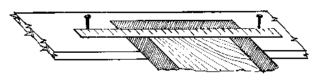
Making Frames at Home
There are available videos and books on all aspects of framing pictures. Telephone 01502 724935 or email mail@moyrabyford.com for videos. Your library has several books on framing.
Your Equipment
(a) Basic Tools: hammer, craft knife (preferably a Stanley knife with spare medium blades), a clear plastic ruler – at least 50 cm in length, a straight edge (unless ruler on mount cutter is detachable) A 1 m steel rule is just right – can be expensive but worth it.
(b) Essential Tools: mitre saw – varies considerably in price – buy the best you can afford (ca £80 - £95). Don’t use an old mitre block. Replaceable blades and a measuring arm attached to your saw are nice. Clamp – I find a single corner mitre clamp is best – one corner at a time. Some framers prefer a 4 corner clamp with a strap tightener and locking device. A hot glue gun (cost ca £20) used in conjunction with the mitre clamp makes “instant” strong joints thus allowing frames to be completed in a few minutes. Finally, pinning the corners – a small wood vice holds a frame firmly to do this. Mount cutter – there are many types available (cost between £10 and £400). One costing about £20 is satisfactory.
 [I use a steel metre rule, Stanley knife, plank and two nails. Angled knife blade cuts, held firmly against rule. You need to practice this. Easy to demonstrate, hard to explain. ‘Phone me for demo.]
Before cutting mount I use a pair of compasses to mark corners of cut. Position picture on mountboard in frame. Position compasses thus.
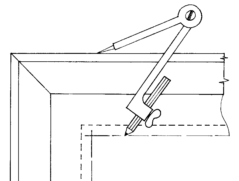
Compass makes a parallel pencil line. Repeat x 2 on all 4 corners.
 Result: Pencil marks on mount board. Cut to intersections of pencil crosses. Once you have the knack of it, practice makes perfect – you can cut perfect mounts quickly and easily.
( c) Luxury Tools: Buying 2mm glass cut to size is expensive. A good glass cutter with oil filled handle (cost £25 - £30) cuts glass easily – the cutter will last for years. Bulk buying glass sheets in many different sizes (packs of 10 or 20 sheets) is very much cheaper.
A Pointgun using framer’s points (cost, including 3000 points, is about £50). It makes picture assembly easy and quick. You can buy a cheap “push” version for about £10.
Always brace frame – especially if you use a hammer/nails to fix.
Finally, buy your moulding, mount and backing board, glass, etc. from a reputable wholesaler, e.g. Wessex Pictures, Beddington Lane, Croydon (020 8683 005). They have an excellent catalogue (cost £10 – refundable on placing orders). Their showroom and staff are very informative – parking on site easy.
If you are interested in making your own frames and require help and demos, contact me. I will be pleased to advise and help for free. Making more than 4 or 5 frames a month quite quickly pays for itself on a do-it-yourself basis. Long term it is a very attractive way to go.
I hope shortly to write further on dealing with different mediums of art work, 3D items, tapestries, etc.
Peter Dinsmore
A Dream Come True
Arriving in Paris I was met at the airport by a French lady holding up a board with bold writing “ARTSTUDY”. It was a one and a half hour’s drive by taxi to our destination together with two more people who had just arrived from the USA. We were going to attend an oil painting course in Giverny by a well known American tutor. On entering the village, we drove along the one-mile long rue Claude Monet passing stoned cott- ages and terraced gardens arriving at a beautiful French country lodge in the middle of the village where we were going to stay for the next ten days. We were introduced to the rest of the group and then were served a delicious lunch out on the patio over- looking the village.
On that same afternoon, we walked down the rue Claude Monet only three minutes away from our lodgings was Monet’s house and gardens. Oh what a sight confronted our eyes… it was breathtaking! It was the beginning of June and the flowers in bloom were prolific…. all the colour and so many different varieties of plants, the lily pads on the ponds covered with water lilies…the irises….the roses….the scent – it was stunning.
We would be painting for ten days in Monet’s gardens en plein eir every day for two hours in the afternoon after all the tourists departed. Every Monday the gardens are closed to visitors so that the gardeners can work there, BUT artists are allowed to go in with special permission. How fortunate we were to spend two full Mondays in the gardens painting, with no people around to peep over our shoulder. What a unique opportunity this was, what better place to observe colour directly from nature.
There were several field trips organised for us during the day which combined seeing many places in the south of Normandy together with painting and our tutor was excell- ent. We were pampered with the traditional French Cuisine together with wine. We also had the opportunity to paint in the famous Musee Baudy Hotel and gardens where the impressionists, Cezanne, Pissaro and other great artists stayed and worked - the Studio is still there. The evenings were spent with lectures, demos and group critiques and discussions.
It was always my desire to visit Monet’s Gardens and it had proved to be an exper- ience of a lifetime…….and for me a dream which came true. I came away with ten oil paintings on linen canvas (one for each day) and of course…. full of inspiration.
Dessie Michael
Paper for Watercolour - Part 3
Don’t waste your money buying cheap paper of poor quality, spend it on the very best. Three of the very best are Bockingford, Saunders Waterford and, my personal favourite, Arches Aquarelle. Here is the last of three items on these papers to encourage members to consider their use. I believe that they are the more economical in the long run. (Ed.)
CANSON ARCHES WATER COLOUR PAPER: This paper maintains its flatness well after wetting. The striking grain lends strength to water colour and both strengthens and reflects the luminosity of the colours.
Top quality water colour paper available in 640g/m² and 850g/m² weights in two surface finishes - Medium Grain (Not) and Extra Rough (Torchon) Format 56cm x 76cm, dry stamp ‘Arches France’. Price per sheet. £6.90 and £9.09 Minimum order quantity 3 sheets.
The above is from the on-line catalogue of greatArt (edited)
From Russia
Memories of the ‘From Russia’ exhibition at the Royal Academy will linger for many months to come. It goes without saying that the quite extraordinary array of French Impressionist art, mainly from the collections of two wealthy aristocrats – Sergei Ivanovich Shchukin and Mikhail Morozov – was an outstanding exhibition in itself. However, for me, the collection of Russian art from 1870 onwards was equally out- standing and a complete revelation. Here were great painters, many of whom I had never before encountered, whose influences ranged from realism through to impressionism, folk art, symbolism, religion, colour and abstraction.
Of particular interest was the number of women artists who emerged in the early years of the 20th century. Below I have listed of some of the less well-known painters for whom I shall certainly be on the lookout in the future.
Isaac Levitan - a landscape artist whose paintings capture the atmosphere of the Russian countryside, particularly the weather.
Konstantin Korovin - who loved Paris and whose painting of this title clearly demon- strates French impressionist influence.
Philipp Malyavin - who came from a peasant background and sought, like Russian composers of that period, to define the national character through his art. ‘Peasant Woman Dancing’ is a symphony in red.
Mikhail Vrubel – a theatrical designer and sculptor as well as symbolist painter. ‘Six-winged Seraph’ was magic. Can’t wait to see more of his work.
Natalia Goncharova studied with Korovin but developed a style all her own combining naivety with cubism.
Kusma Petrov-Vodkin also worked in the theatre and as a graphic artist. His ‘Virgin of Tender Mercy’, painted during World War 1, is one of the most moving religious paintings I have encountered.
Nathan Altman.- Such magnificent portraits! such magnificent colour!
Liubov Popova, Alexandra Exter, Nadezhda Udaltsova and Olga Rozanova. Women who embraced cubism in their futurist styles and who all demonstrated the Russian passion for colour.
My love of Russian music now extends to a love of Russian art!
Christine Richards
Art / Craft - What is the Difference? Is there any Difference?
Chambers Pocket Dictionary 2001:
Art -The creation of works of beauty, especially visual ones; Such creations thought of creatively; Human skill and work as opposed to nature; A skill, especially one gained through practice.
Craft - A skill, trade or occupation, especially one requiring use of hands; Skilled ability.
Clue The Guardian quick crossword : `creative sewing`- answer `embroidery`!!!
Creativity is not mentioned in connection with craft. Are craft items always useful? I recently went to two exhibitions: `Out of the Ordinary: Spectacular Craft` at the V & A 13.11.07 - 17.02.08 and Designer Crafts at the Mall 2008. Very few useful items, but a lot of fine art!
As an embroiderer I feel I use fabric, thread and stitch as an artist would pencil, paint and paper. Fabric can be painted, dyed, drawn on, cut, burnt, applied to another surface; threads can be dyed, mixed, stitched adjacent to, over/ under each other, together to mix them. This is not as flexible as paint or pastel. Textural qualities are easier to achieve with fabric and thread. Work can be representative, figurative or abstract and certainly conceptual. The needle can be loaded with colour and applied to a background which has been coloured, dyed, screen printed and had fabric and thread adhered to it. Paper, tissue, plastic and any number/variety of fabrics, photographs, threads, yarns, string, ribbon can be used. Fabrics can be made by using dissolvable fabric, weaving, crocheting, knitting, stitching and felting. Texture can be created by fabric weave, fraying, use of stitch, plastic, specialist fabrics, gels, paints, knitting, crochet, felting, etc.
Ceramicists, woodworkers, metalworkers would all be able to say the same for their own medium.
It’s what you do with it Art?
Does craft have to be useful?
Can craft be conceptual?
Is craft creative?
Contemporary embroidery is more like conceptual art - any article in `Embroidery` published by the Embroiderers’ Guild has examples of artist and their art. Janet Naylor, a leading embroiderer, says her needle is her paintbrush and her threads are her colour palette.
What do you think?
Sue Howes